 BPSDB I refer of course to Anti-Science Syndrome (ASS) as described at Climate Progress, and Michael Asher at Daily Tech has it bad.
Barely a week after Deltoid noted that the Arctic ice situation was so bad that no climate change Denier would be so stupid as to try and claim things were OK, Asher published “Sea Ice Ends Year at Same Level as 1979”
Now Asher’s piece is so transparently false that I didn’t consider it worth debunking, but just as Lambert underestimated the Denier’s guile, I underestimated their fans gullibility. Sure enough this thing has been popping up around the net as if it were believable.
What he has done here is some simple kiddy “white lies” most of which you can spot if you just look at the graph he provides and read the text thoughtfully.
Asher states “…global sea ice levels now equal those seen 29 years ago…” So how is he being misleading?
By cherry picking his:
Area: Notice his choice of “global.” Most of the recent concern has been about the Arctic, but he is talking about global, and indeed for the rest of the article he refers to the state of ice levels as if the article were only talking about the Arctic, and as if the Arctic is at historic levels.
Terms: Notice also the choice of “levels,” meaning the more usual ‘area’ or ‘extent’, not the more telling (but difficult to measure) ‘volume.’
Ice “extent” refers at least 15% ice cover, ie it does not distinguish between places that have 15% thin drift ice and areas with a 3 km thick ice sheet. As far as the measure “extent” is concerned they are the same.
Not that ‘extent’ isn’t useful, but it is term that lends itself to abuse if someone wants to mislead people, and Asher clearly does.
Time: The timing is particularly important for Asher’s statement to be strictly “true” as stated, both in terms of it being late fall and in terms of 1979 to present.
Sleight of Hand
Just as a con artist distracts you with one hand while he palms a card or switches the dice, Asher focuses your attention on the irrelevant.
Asher: “ That anomaly now stands at just under zero, a value identical to one recorded at the end of 1979, the year satellite record-keeping began.”
The anomaly standing at zero is absolutely meaningless at this time. Look at the graph, the anomaly (red) has touched zero over and over in the past 30 years, while the overall downward trend is clear even to the naked eye, particularly in the past decade.

Source: Cryosphere Today
He does the same thing with sea ice area (blue line). Yes at the moment the line is touching 17 million sq km, but so what? it has done so repeatedly in the past 30 years.
The important thing to look at is the comparison of the area (blue) to the 1979-2000 average (grey). Note how more and more the daily mean(blue) is well below the average (grey) ie less ice area.
Time of year is important because we have a situation where there has been a relatively rapid initial freeze in the Arctic (although that has declined rapidly), so there was a quick build up of thin yearly ice. It now matches 2006-2007 and is well below the 30 yr average (below).

Source: National Snow and Ice Data Center
Here’s the NSIDC commentary from Dec 3 (2008):
“The period of very rapid ice growth that characterized October and early November has ended. The rise in ice extent over the past three weeks has been much slower, and should continue to slow until the expected seasonal ice extent maximum is reached sometime in March.”
Whereas the Antarctic summer has not yet had it’s full impact onthe southern ice, although it is clearly in decline (below).
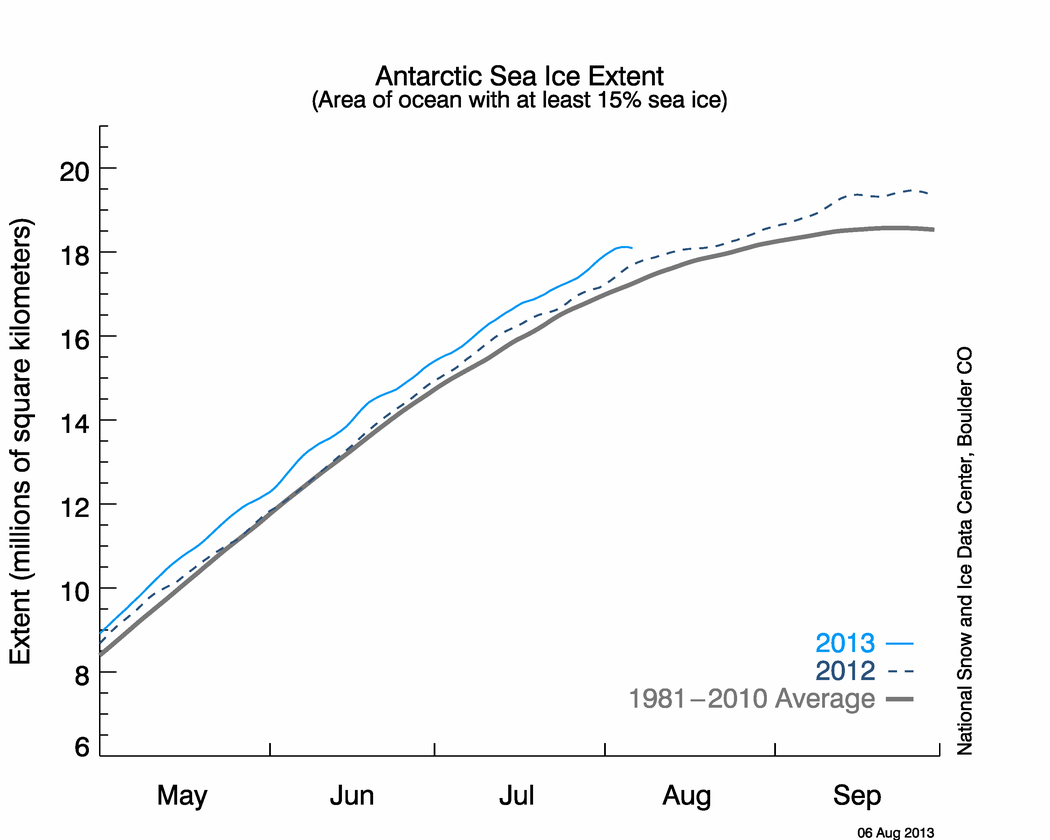
Source: National Snow and Ice Data Center

What’s really going on? The Arctic sea ice extent is actually at a record low and ice volume (ie long term thick ice) has been in catastrophic decline.
Antarctica is a more complex situation which as far as I know is not yet fully understood.
Here again the important thing to understand is that we are talking about sea ice extent, which is NOT the same as “amount of ice.”
It is clear that there is more sea ice, but it is equally clear that Antarctica is in serious trouble.
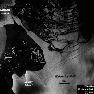
NASA Satellites Watch Polar Ice Shelf Break into Crushed Ice
“The breakup is the latest of seven major Antarctic ice-shelf collapses in the past 30 years, after some 400 years of relative stability. They include the detachment of a 1,300-square-mile chunk from the Larsen B ice shelf, the disintegration of giant ice shelves in the Prince Gustav Channel and the Larsen Inlet, and the disappearance of ice shelves known as Jones, Larsen A, Muller and Wordie. All of them corroborate temperature measurements showing that the western Antarctic Peninsula-now known to insiders as the Banana Belt-is warming up faster than anyplace else on earth.”
So how does that lead to more sea ice? For one thing there seems to be shifts in the Antarctic currents which are confusing the interpretation.
For example, a warm current diverted away from the Antarctic may cause sea ice to melt slower. Equally a weakened current can cause drift ice to not disperse as rapidly which means it takes longer to fall below the 15% ice coverage threshold to qualify as “ice extent.”
Another factor is best explained by the Climaticide Chronicles:
“No one’s entirely sure what’s causing the expansion of sea ice in Antarctica, but the likeliest explanation is a disturbing one. “According to a 2005 NASA-funded study, warmer temperatures have caused greater snowfall around the continent’s edges, where the open oceans provide plenty of raw material for precipitation. (Warmer air absorbs moisture more readily.) The weight of that excess snow pushes sheets of sea ice down into the water, causing more water to freeze.”
Another curious artifact of the “ice extent” measure is how it measures ice shelf break up. Imagine an ice shelf of area N as measured over years. Then the shelf breaks up.
If 1/2 of the ice sheet melts, and the remaining 1/2 spreads out over twice the area that the shelf had occupied, then the total amount of ice is 50% (1/2), but the “sea ice extent” has doubled because the entire area has 25% ice cover.
Regardless of which factors are at play and to what extent, the trend is absolutely clear. Asher uses the global average to try and mislead the reader to believe that ice conditions at the poles are the same as they were in 1979, which is obvious nonsense. Climate change is causing rapid changes to the ice at both poles, and the Arctic is in serious decline.
So how did Asher sum up?
“In May, concerns over disappearing sea ice led the U.S. to officially list the polar bear a threatened species, over objections from experts who claimed the animal’s numbers were increasing.”
Clearly he wants you to believe that his false combining of the Arctic and Antarctic ice extent means the Arctic is fine, which it clearly is not. Of course that kind of misleading nonsense is typical for Asher, and I will be going over more of his posts in future.
See also “Less Sea Ice in the Arctic, More in the Antarctic, and, of Course, the Denialists Get It All Wrong“
UPDATE: Jan 16
Tamino has done a lovely job exposing Asher’s con job with his Cold Hard Facts piece:

Peter Sinclair has also debunked it in video format:
and
“The Scoop on Southern Polar Ice”
![]()
We give our consent every moment that we do not resist.
Denier “Challenge” aka Deathwatch Update: Day 78 … still no evidence.
IMAGE CREDITS
Ass cracks and cleavage by Rainier N.


The Asher piece was almost immediately picked up by World Net Daily, the religious right wing website. These people think the world is flat and that global warming is a plot to enact new taxes and “enslave” Christians by putting the earth before money… Someone has to put the bell on the cat, but they immediately yell “religious persecution” if the word science is mentioned.
—-
“Whereas the Antarctic summer has not yet had it’s full impact on the southern ice, although it is clearly in decline”
– but isn’t the graph showing that it is still above the historical average? [1]
Also, why does the graph showing Arctic Sea Ice Extent omit 2007-2008? Wasn’t this the record low level? [2]
—-
> …misleading nonsense is typical for Asher…
And then some. I engaged him in the comments of one of his articles last year. He’s either completely unhinged or he knows that he is lying by omission / cherry-picking. I’ll go for the latter. I think he knows the value of “a lie told often enough becomes truth”, AKA http://en.wikipedia.org/wiki/Big_Lie
He’s also very proficient at sandwiching big lies between small truths to give the appearance of balance.
Scanning down the, largely moronic, comments was this little exchange:
Denier Bob: “Nice article, but who lit a fire under Asher? He’s certainly been more active than usual.”
Reality Rachel: “Exxon must have given him extra time off for Christmas.”
Regarding the Arctic Sea Ice Extent:
At the NSDIC web site, they explain why they are only showing the 2006-07 data:
“Note: The daily extent chart now shows the winter of 2006 to 2007 (dashed green line). The graph will continue to show 2007, which went on to reach the lowest summer minimum in the satellite record.”
This makes sense but it could be seen as cherry picking by some. Is is difficult to see if the extent is greater than last year by omitting this data.
GreenFyre,
Hate the title. 😦
But the article’s illustration of how Asher manufactured his science on the ice situation is just excellent! 🙂
[…] I find that the work has already been done in wonderful, cited detail by the blog greenfyre’s. So in the interest of time and on the off chance that anyone is still reading this, I will urge […]
I stumbled across this post (and your blog) and just wanted to say thanks for all your work! Very well done.
-Jamie
—-
[…] In fact, George relied, almost certainly, on another deceiver whose deception was unraveled by greenfyre. […]
[…] fact, George relied, almost certainly, on another deceiver whose deception was unraveled by greenfyre. This compared (incorrectly, it seems) Dec 1979 with Dec 2008 ice and this misleading piece has […]